COVID-19 Visualized 🤒
Goal
With this project, I wanted to showcase that data is in every aspect of our life, and sometimes it’s more than just numbers on a screen. Also, although sometimes it can be worrisome and bleak, we can learn from it. Here, I wasn’t necessarily aiming to answer any specific questions, but rather just explore the data, and see what I could take away from it.

Data Sources, Cleaning, & Exploration
I got the main dataset from Our World in Data. There were various different fields that were included, but I chose to focus primarily on the infection, death, and vaccination data for the visualization. I also explored hospitalization data, but decided not to visualize it.
First, I was initially going to just focus on death and infection rates, so I reformatted this dataset in Microsoft Excel to make querying a bit easier. For example, I removed certain fields that I wasn’t interested in (e.g. diabetes prevalence, GDP, life expectancy, etc.), and saved a new modified table in order to query from (‘CovidDeaths’). I then used Microsoft SQL Server to query the data.
I encountered a few issues when trying to manipulate this particular data set. For example, certain fields such as ‘location’, were including data on income ranges, so I had to filter it out with a particular WHERE clause to avoid it.
After wanting to explore the data a bit further, I went back and created another table with the missing data on vaccinations (‘CovidVaccinations’). Although all the data was initially all contained in one original .csv file, I decided to leave out a common field I’d need (‘population’), in order to practice using JOINS.

SELECT Statement

CTE

Temp Table
SQL Queries
Here are some example queries that I used to make this project. Since I used the free version of Tableau, I had to manually export the .csv files of the queries then connect them afterwards. I tried to include a variety of queries, ranging from simple SELECT statements to more complicated ones where CTEs and Temp Tables were used.
You can find all the queries on my GitHub. If the text is too small to view here, you can right click and open the images in a new tab.
Query A

Query B
Query C
Query D

Query E

Query F
Observations
Overall, after manipulating the data in different ways, I noticed that some of the numbers were kind of contradicting themselves. How was it that some of the countries with the lowest fully vaccinated rates, had the lowest death rates? In terms of the data itself, it could come down to how accurate the reportings were. When humans are in charge of acquiring the data, there will always be the possibility of error. For sure, there were people who had COVID, but never got tested, therefore never became a statistic, yet as a result, multiple people contracted it from them, and may have contributed to that continued that cycle.
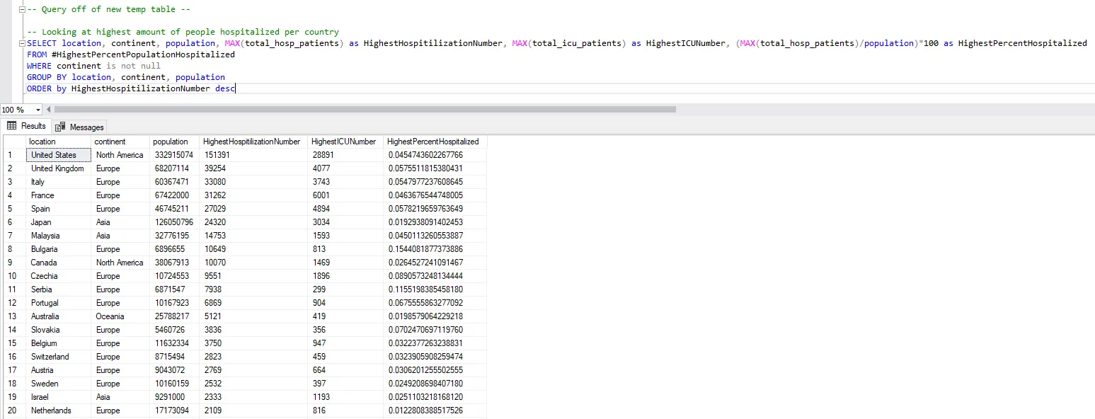
For some specific numbers, particularly when observing the hospitalization rates based on the entire population, I found that of the top 20 countries with the highest rates, 85% of them were European (Query A). When looking at the top countries based on those infected however, only 70% were.
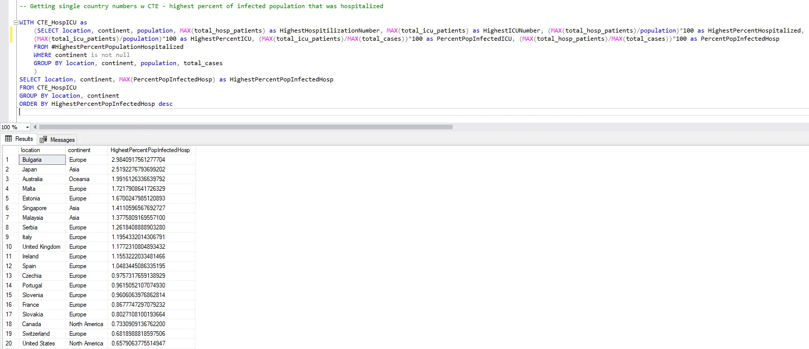
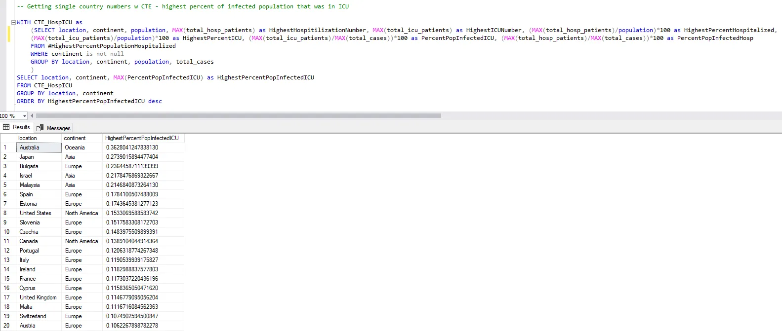
I found that although the US had the highest hospitalization count worldwide of 151391, as well as the highest ICU count of 28,891, they ranked 13th (~0.04% hospitalized), and 8th (~0.008% in ICU) for rates when compared to the total country population (Query B). When these numbers were instead compared to those who got infected, the US ranked 20th (~0.66% of people infected with COVID-19 were hospitalized), and 8th (~0.15% of people infected were in ICU) (Query C, and D, respectively).
For Canada, the largest hospitalization count was 10070, and the largest ICU count was 1469, ranking them 21st (~0.03% hospitalized) and 9th (~0.0038% in ICU) worldwide when compared to the total country population. When these were then compared to those infected, Canada ranked 18th (~0.73% hospitalized), and 11th (~0.14% in ICU).
Worldwide, the country with the highest hospitalization rate compared to those infected was Bulgaria, with ~2.98%. They also ranked 3rd for the highest ICU rate of those infected (~0.23%). Additionally, the country with the highest ICU rate compared to those infected was Australia, with ~0.36. They also ranked 3rd for the highest hospitalization rate of those infected (~1.99%). Japan shared this top 3, ranking 2nd for both (~2.52% hospitalized, ~0.27% in ICU)
When observing the death data, I found that the global death percentage for those infected with COVID-19 was ~1.67%, meaning if someone was infected with COVID-19, they had over a 98% chance of survival. This number didn’t account for any other variables such as age, underlying health conditions, etc.
When comparing countries, I found that Peru had the highest death percentage of ~0.61%. The US ranked 21st at ~0.25%, and Canada was 91st at ~0.08%.
When examining the vaccinations data, I found an odd outlier. It said that Gibraltar had a fully vaccinated percentage of 118%. After some further research, I found out that it wasn’t a miscalculation, but rather caused by Spanish citizens who work daily in Gibraltar which inflated the actual number (100%).
I also used a query to calculate the world average of those fully vaccinated, then used that number to determine which countries were above and below. I found that out of those below the world average (<46.92%), ~49% of them were African countries, with those selected countries having an average fully vaccinated rate of only ~11.75%. Only 6 African countries were above the world average.
Additionally, 4 of the top 10 most populated countries in the world (Indonesia, Pakistan, Nigeria, and Bangladesh) all had below average fully vaccinated rates, with Nigeria being the 10th lowest in the world (Query E). The US ranked 82nd at ~62.29%, and Canada was 21st at ~78.06%. However, when compared with countries with significant populations of more than 10 million, Canada ranked 10th (Query F).
Moving Forward
When analyzing data, it’s important to make observations, but sometimes, you want to have more specific questions that you might want to ask. In this particular project, I was manipulating, and then displaying the data, more than answering a specific question. If I wanted to explore the data further, I could ask for example, “Why might Peru have the largest death percentage?”. I could also explore other fields such as age, and see how that might have an effect on the data.
Some things that I could've done better include the naming of certain fields when querying. I tried to make it easy to understand, but sometimes they just got really lengthy, and sometimes they weren’t as consistent with the names of other previous queries. These changes moving forward would allow someone else reviewing the work to follow more easily.
This was my first project actually using SQL, as well as displaying it in Tableau. I tried to keep the visualization simple to navigate, but effective. Overall, I encountered a lot of issues along the way, and there’s most likely more efficient methods compared to the ones I used, but the process of working through it in itself was a rewarding experience. For example, I learned how to use CTEs, temp tables, subqueries, and views.
Additionally, when compared to what I was seeing on the news, this data gave me a different perspective. This is by any means not to say that what we all experienced was nothing to be cautious about, or disrespectful to those whose lives were directly affected by it, and that we should’ve been careless in how we carried ourselves during this time, or how we do so moving forward. Rather, sometimes numbers and the media can be more alarming when compared to the grand scope of things. Our anxieties when consuming media could also be heightened, which in turn could affect our physical and mental health. Things such as choosing a few trusted, reliable sources, limiting the amount of time spent watching the news, and instead discussing events with others to help gain different perspectives, and acknowledge what is happening, may be more beneficial. At the end of the day, it’s your responsibility as a human to respect other human life by acting safely and respectfully.
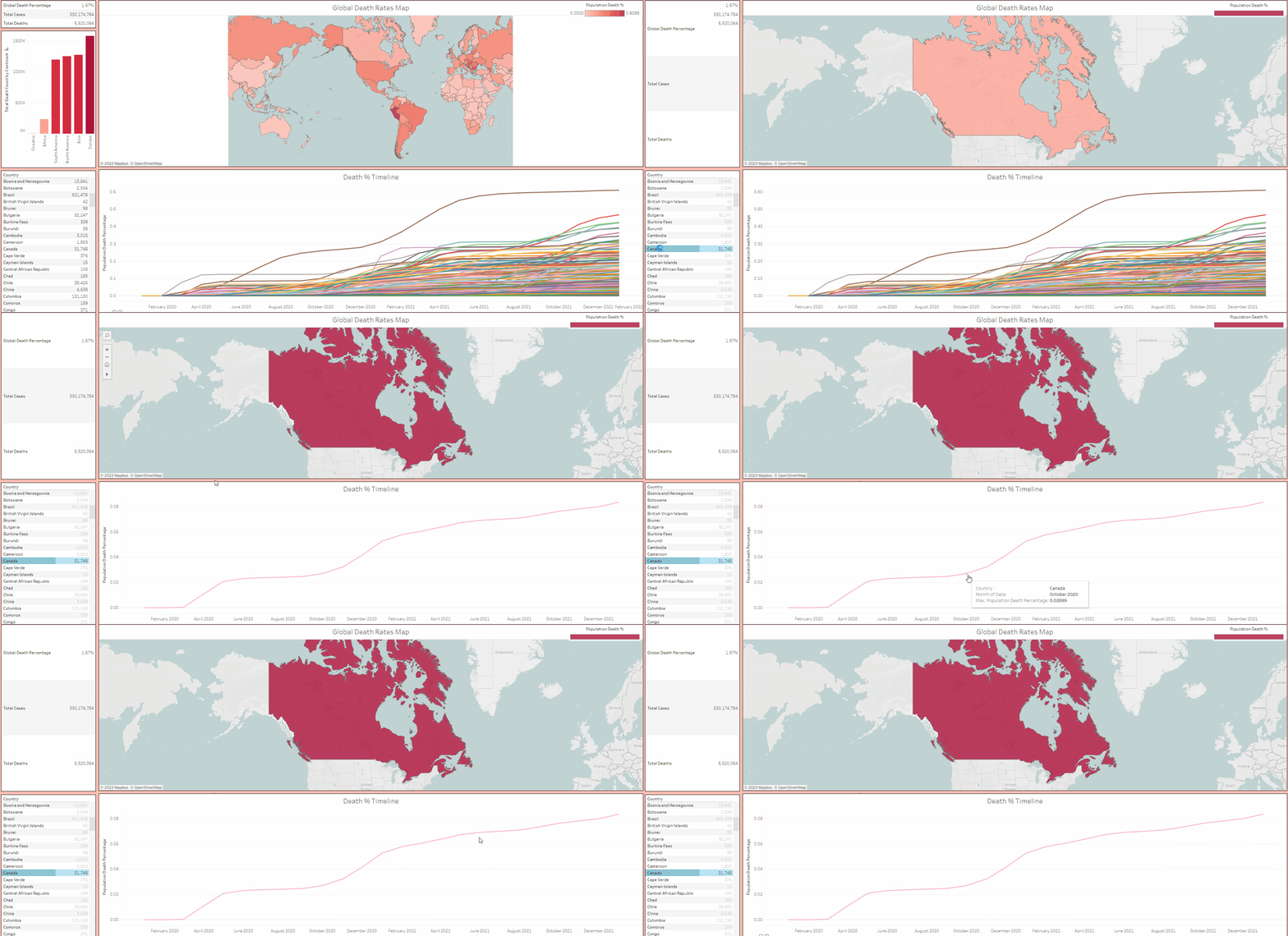
Here's a link to the Tableau visualization. Make it full screen to experience it properly. Click on the GitHub icon for a full list of the SQL quereies used.


